
Nothing launcher (Beta) is now live on the Google Play Store and can be downloaded on select phones including the Samsung Galaxy S21, Galaxy S22, Google Pixel 5 and Pixel 6. It’s just a launcher and might not have created as much buzz, had Nothing not announced a phone only last month. Carl Pei’s new company has made big claims about how it plans to change the future of smartphones. It’s already been compared to Apple. Even though the phone or its specifications are yet to be out.
The Nothing launcher is the first real look at what the company’s much-hyped phone may offer. It’s promising and suggests that the future might be better. I downloaded the Nothing launcher on the Samsung Galaxy S22 and here is what you should know about it.
How to Install Nothing launcher?
The installation and setup process were pretty simple, at least for my Galaxy S22. Since this is a beta version, the icon doesn’t appear on the home screen. After downloading Nothing Launcher (Beta) via the Google Play Store, I only had to change the default home app from the settings. Nothing has also released a few wallpapers and ringtones for the launcher. These need to be downloaded separately.
Neat and clean design
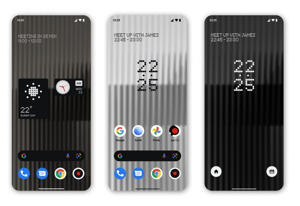
Once the launcher is enabled, it presents you with a neat and clean home screen in a 4×5 layout, with a few pre-installed Google apps and Nothing’s signature wallpaper. The layout can be changed to 5×5 as well. The default icon pack comes from Nothing. The icons are round, look refreshing and are nicely spaced out. The launcher supports third-party icon packs too.
The home screen is pretty simple. The Google search bar sits on top of the bottom dock. But, the Google Discover feed on the left is missing.
You can swipe up to open the app drawer. It feels snappy. There is an ‘Always show keyboard’ option here. When enabled, this launches the keyboard automatically whenever you open the app drawer. It allows you to directly search for a specific app. I found it useful.
Apart from the pre-applied wallpaper, Nothing has released two more wallpapers that are largely in its colours. The default wallpaper makes it difficult to read the on-screen text because of its grey colour. The wallpapers can be changed by long pressing the home screen. It first takes you to the phone’s default wallpaper picker though.
The other option on the home screen is to add widgets. Nothing has added three ‘bespoke’ widgets here – a digital clock, an analog clock and a weather widget. I am not impressed with the implementation. The choice of colours and font make them unreadable on the home screen. Also, I realised if I put two big widgets on the home screen, I can’t really use ‘Max icons’ which is probably the most fun part about this launcher.
It’s a very unique feature. The launcher allows you to increase the size of an icon or folder to separate it from the crowd. It’s very easy to use as well. Just hold any icon on the home screen and you can expand or minimize it. The launcher also supports notification dots, so you’ll see a tiny dot on top of an app with unread notifications.
Nothing launcher: Quick review
The Nothing launcher looks raw at this stage. It has very few unique or quality features. The company will definitely have to work on the font style and colours to make it more user-friendly. We should also expect more customisations on the final version. But, even the beta is simple, neat, snappy and different from other third-party launchers out there. It shows a lot of promises in terms of what we can expect on the Nothing phone. The launcher will soon be available on the OnePlus devices as well. So, do try it out and let us know your thoughts.